Chromatic Ghosts: Marrying Ink and Watercolor’s Ethereal Dance
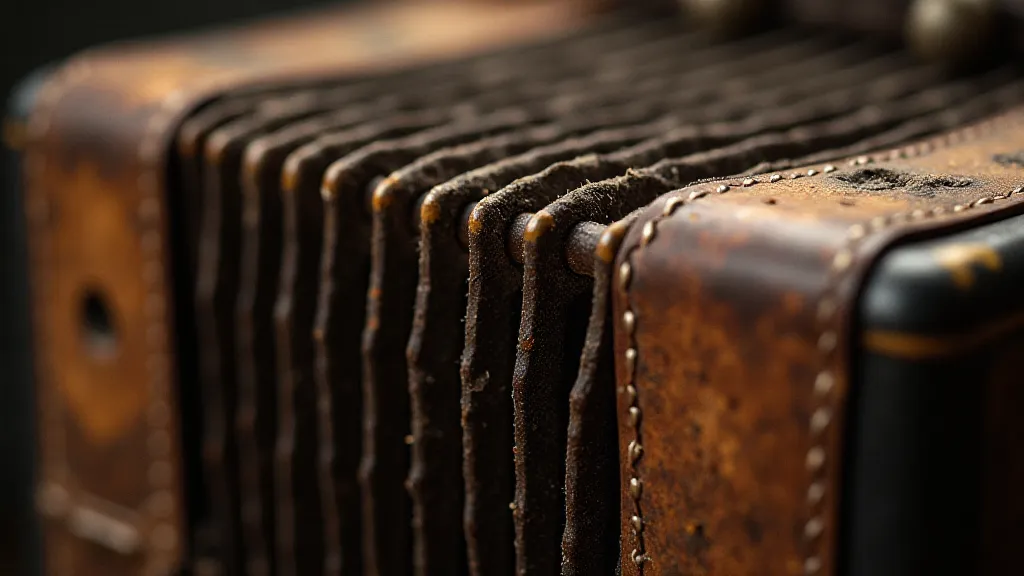
There's a particular resonance I find in antique accordions – a feeling of whispered histories, of bustling ballrooms and quiet home practice. Their bellows, once vibrant with music, now often bear the patina of age, a delicate layering of dust and faint, lingering scents. It’s that layering, that sense of something precious existing *within* the passage of time, that guides my approach to combining pen and ink with watercolor in botanical illustration. It’s not merely about adding color; it’s about creating a spectral echo of the plant, capturing its essence within a luminous, layered dance.
For years, my botanical illustrations were strictly pen and ink – precise, detailed studies rooted in scientific accuracy. I admired the clarity, the uncompromising faithfulness to form. But I felt something was missing. A vitality. A breath. I wanted to evoke the *feeling* of a plant, not just document its structure.
The Foundation: The Precision of Ink
The foundation of any successful ink and watercolor botanical illustration is, undeniably, the ink linework. This isn't a stage for coloring; it's a framework, a skeleton upon which the watercolor’s ethereal qualities will cling. The initial line drawing should be meticulously crafted – accurate in its representation of the plant’s anatomy. Consider plant anatomy drawing as a core skill. Understand the venation of leaves, the spiraling arrangement of petals, the subtle curves of stems. This understanding informs your lines, allowing you to capture the plant’s inherent beauty even in monochrome.
Experiment with different pen types. A fine-tipped technical pen (0.1mm or smaller) is excellent for capturing incredibly detailed structures. A slightly thicker pen (0.3mm - 0.5mm) can add a touch of dynamism, especially when used for thicker stems or outlines. Hatching and cross-hatching are your friends. These techniques not only add tonal variation but also a sense of texture that will interact beautifully with the watercolor washes.
The Watercolor’s Whisper: Introducing Color with Restraint
The introduction of watercolor should be considered a conversation, not an invasion. The ink lines have already established the form and structure. The watercolor's role is to enhance, to suggest, to create an atmosphere. Think of the pigments as a whisper, rather than a shout.
Start with diluted washes. The water-to-pigment ratio is crucial. A very watery wash will allow the ink lines to peek through, creating a delicate interplay of contrast. As you build up layers, the ink will gradually disappear under the color, but its presence will remain as subtle tonal variations.
Color choices are paramount. Restraint is key. Often, a limited palette – perhaps just two or three colors – will produce the most compelling results. Consider the plant’s natural color scheme, but don't be afraid to deviate slightly to achieve a desired effect. Observe antique botanical illustrations for inspiration. Many of them use subtle earth tones and muted greens to convey a sense of timelessness.
Rendering Plant Textures: A Delicate Balance
One of the most challenging – and rewarding – aspects of combining ink and watercolor is rendering textures. The precise lines of the ink can define the structure, while the watercolor can evoke the softness of a petal or the roughness of a leaf’s surface.
For smooth surfaces like petals, use very diluted washes and gentle, sweeping brushstrokes. Avoid hard edges, allowing the color to fade subtly into the white of the paper. For rougher textures, use slightly more concentrated washes and vary the brushstrokes. A dry brush technique – using a brush with very little water – can create a broken, textured effect.
Remember, you’re not trying to *duplicate* the texture exactly. You’re trying to *suggest* it. The viewer’s mind will fill in the rest.
Shading in Pen and Ink – A Foundation for Watercolor
Even before adding watercolor, careful shading in pen and ink can profoundly influence the final result. Hatching, cross-hatching, and stippling can create a tonal underpainting that interacts beautifully with the watercolor washes. Darker areas will absorb more pigment, leading to richer tones, while lighter areas will remain more transparent, allowing the ink lines to show through.
Experiment with different shading techniques to see how they affect the final appearance. A smooth, even hatching can create a soft, diffused effect, while a more irregular hatching can create a more dramatic, textured look.
The Watercolor and Ink Combination: Layering for Depth
The layering process is where the magic truly happens. Start with very light washes, allowing each layer to dry completely before applying the next. This allows you to build up the color gradually, creating subtle transitions and tonal variations. Don't be afraid to experiment. There are no hard and fast rules. Let the plant guide you.
Occasionally, revisit your ink lines. Add details that were previously obscured by the watercolor. This adds depth and complexity to the illustration. Consider adding subtle variations in line weight to create a sense of movement and vitality.
Drawing Scientific Illustrations & Collecting Considerations
The principles I’s outlined here are especially relevant to those interested in scientific illustration. Precision and accuracy remain paramount, but the subtle addition of watercolor can elevate the work from a purely technical document to something with artistic merit. The layered approach also mirrors the painstaking process of restoration – carefully revealing the beauty hidden beneath layers of time and wear.
For those interested in collecting antique botanical prints, look for pieces that demonstrate a masterful use of ink and watercolor. Pay attention to the quality of the paper, the sharpness of the lines, and the subtlety of the colors. A well-executed piece will possess a timeless beauty that transcends the limitations of its age. Similar attention to detail is needed when restoring a vintage accordion - the right brush and delicate touch are essential.
Embracing the Chromatic Ghosts
Combining ink and watercolor isn't just a technical exercise; it’s a conversation with the plant, a dance between precision and fluidity, a process of embracing the “chromatic ghosts” – the subtle echoes of the past that resonate within the present. By understanding the foundational principles of both media, and by cultivating a spirit of experimentation, you can create botanical illustrations that are both technically proficient and emotionally compelling.