Dancing with Light: Highlighting Botanical Surfaces with Ink
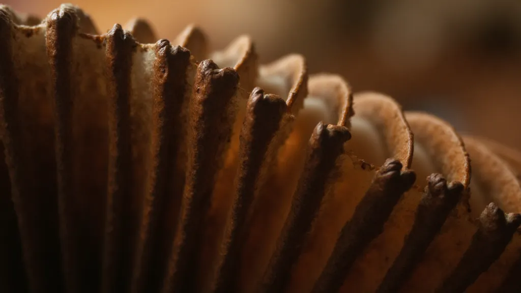
There’s a peculiar beauty in the way light dances across a worn surface. Think of an antique accordion, its bellows slightly cracked, the leather softened by decades of use. Light doesn’s just reflect; it reveals the history etched into the material – the countless melodies played, the hands that caressed its keys, the journeys it’s witnessed. That same principle applies to botanical illustration. It's not merely about capturing a plant's shape; it's about revealing its life, its texture, its very essence through the subtle play of light and shadow.
My own fascination with botanical illustration began, surprisingly, with those antique accordions. My grandfather, a travelling musician, collected them. As a child, I’d spend hours mesmerized, watching him breathe life into those instruments. The way he meticulously repaired them – carefully re-gluing bellows, replacing cracked leather – instilled in me a deep respect for craftsmanship and an understanding that beauty often resides in the details. He taught me that even the most damaged object held a story worth preserving, a lesson I’s apply to my art.
The Foundation: Understanding Light and Form
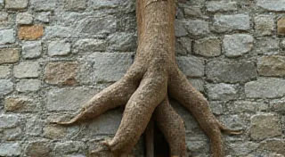
Before a single line of ink touches paper, it’s crucial to understand the relationship between light, form, and shadow. Botanical surfaces, from the velvety texture of a petal to the waxy sheen of a leaf, react to light in unique ways. Observe closely. Where does the light hit the plant directly? Where are the areas plunged into shadow? How does the light soften along the edges of forms, creating a sense of three-dimensionality?
This observation isn’t just about visual acuity; it’s about cultivating a sense of empathy for the subject. It's about understanding how the plant *experiences* light. A thick, leathery leaf will hold shadow differently than a delicate flower petal. A curved surface will reflect light differently than a flat one. Practice drawing simple geometric forms – spheres, cubes, cylinders – under different light sources to truly grasp these principles. Then, move onto simplified botanical shapes.
The Tools: Hatching, Cross-Hatching, and Stippling
Pen and ink offers a remarkable range of textural possibilities, primarily through three techniques: hatching, cross-hatching, and stippling. Hatching involves drawing parallel lines close together to create tonal variations. The closer the lines, the darker the area appears. Cross-hatching takes this a step further, layering sets of parallel lines at different angles. This creates even richer tonal depths and a more complex visual texture.
Stippling, on the other hand, uses dots. The density of the dots determines the perceived darkness. While initially appearing more laborious, stippling can create incredibly subtle gradations and a soft, diffused effect – perfect for capturing the delicate fuzz on a stem or the translucent quality of a petal. Experiment with different pen sizes and line weights to achieve varied effects. A fine-point pen is ideal for intricate details and subtle gradations, while a broader pen can create bolder shadows and a more dramatic feel.
Rendering Botanical Textures: A Delicate Balance
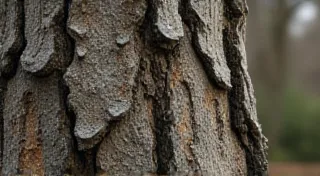
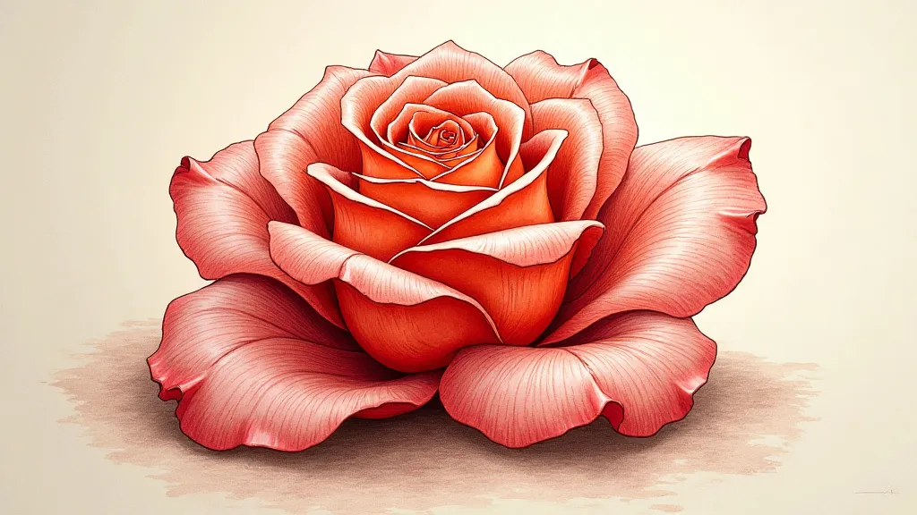
The beauty of botanical illustration lies not just in accurate representation but also in capturing the essence of the plant’s texture. Consider a sunflower petal: its surface isn't uniformly smooth; it has subtle ridges and valleys. Use hatching and cross-hatching to accentuate these irregularities. A velvety texture, like that of a pansy, can be suggested through short, slightly curved lines, mimicking the nap of the fabric. Waxy surfaces, like those found on succulent leaves, require a different approach – use smoother, more evenly spaced lines to convey the sheen.
It’s easy to fall into the trap of overworking the drawing. Less is often more. A few carefully placed lines can be more effective than a dense, cluttered field of ink. Allow the white of the paper to breathe, creating highlights and a sense of lightness. Think of the way sunlight filters through the leaves of a tree, creating dappled patterns of light and shadow. That’s the effect you’re striving to achieve.
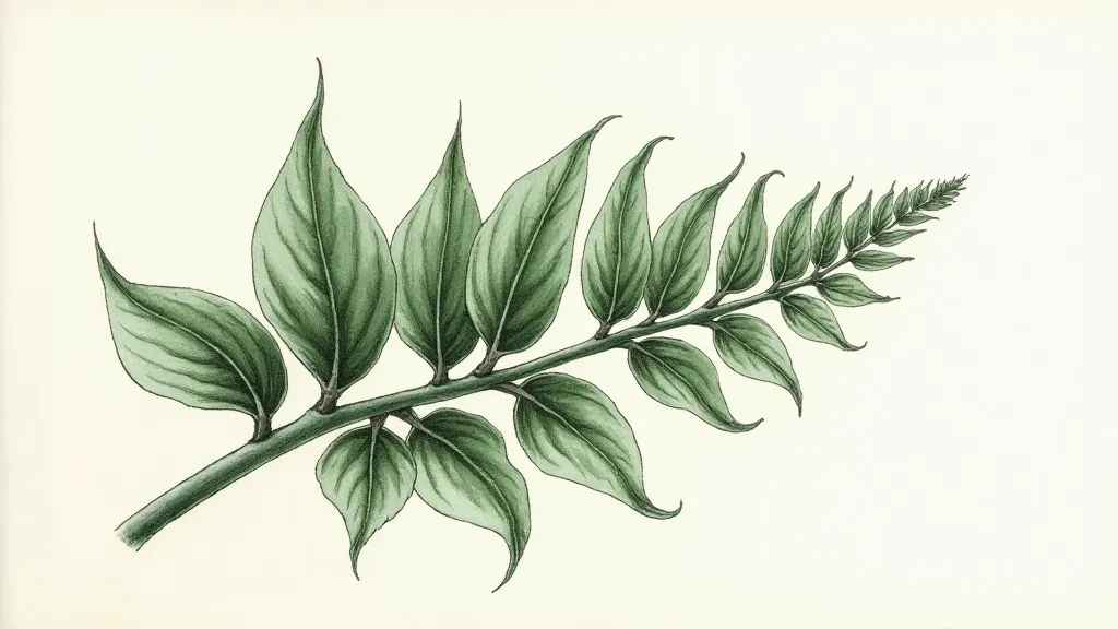
Drawing Leaves and Flowers: Specific Considerations
Leaves present unique challenges. Their complex shapes and often intricate venation require careful observation and a nuanced approach to shading. Study the way light interacts with the curves and contours of the leaf surface. Use hatching and cross-hatching to define the veins, making them appear to recede into the leaf tissue. Flowers, with their delicate petals and intricate details, demand a particularly light touch. Use stippling to create soft gradations and suggest the translucency of the petals. Don’t be afraid to leave some areas unshaded, allowing the white of the paper to represent the highlights.
When drawing scientific illustrations, accuracy is paramount. While artistic license is acceptable in some contexts, scientific accuracy dictates careful observation and precise rendering of details. Study botanical anatomy diagrams to understand the underlying structure of the plant. This knowledge will inform your drawing, allowing you to create a more accurate and informative illustration. Understanding the underlying structure, even subtly reflected in the shading, adds a layer of depth and scientific integrity to the artwork.
Combining Ink with Watercolor: A New Dimension
While this guide focuses on pen and ink, the possibilities expand exponentially when combining ink with watercolor. The ink provides the foundational linework and tonal structure, while the watercolor adds washes of color and subtle nuances of value. This allows for a wider range of expressive possibilities. A light wash of watercolor can soften the harshness of the ink lines, creating a more ethereal effect. Conversely, a layer of ink over watercolor can add definition and contrast.
Think back to that antique accordion. The combination of worn leather, polished wood, and brass keys – each material reacting to light in its own way – creates a visual richness that’s deeply evocative. With pen and ink, and perhaps a touch of watercolor, you can capture that same sense of depth, texture, and life in your botanical illustrations.
The journey of learning pen and ink botanical illustration is one of observation, practice, and a deepening appreciation for the natural world. Embrace the challenges, celebrate the small victories, and allow your passion for plants to guide your hand. Just as my grandfather meticulously restored his accordions, breathing new life into forgotten instruments, you can bring the beauty of plants to life through your art.