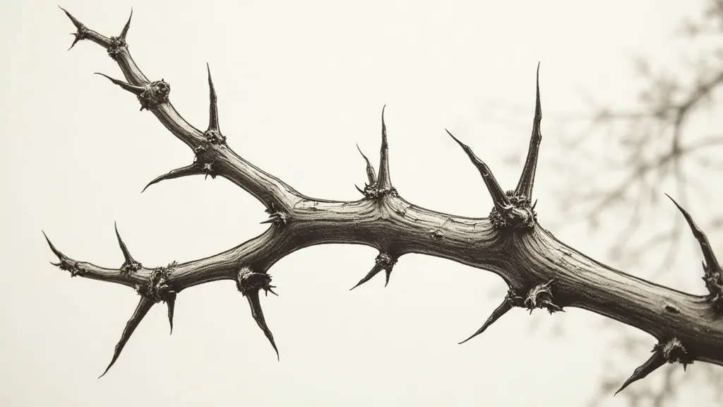
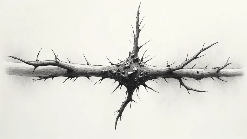
The Language of Thorns: Conveying Texture and Character
There’s a certain melancholy beauty to thorns. They aren’t simply defensive mechanisms, rigid barriers against a hostile world; they are silent storytellers, testaments to the plant's tenacity, its struggle for survival. As botanical illustrators, it’s our responsibility to capture not just their form, but their character – that prickle of defiance, the subtle play of light and shadow that reveals their unique texture. This isn’t merely about drawing a sharp point; it’s about speaking the language of the thorn.
My journey into appreciating such subtle details began unexpectedly. My grandfather, a quiet and meticulous clockmaker, possessed a collection of antique accordions. Not the flashy, stage-bound instruments, but smaller, more intimate ones, many of them originating in central Europe. He’d spend hours meticulously cleaning them, repairing bellows, and replacing worn reeds. The process wasn’t about the music; it was about honoring the craft, the precision, and the history embedded within those delicate mechanisms. I remember the scent of aged wood and leather, the satisfying click of tiny screws, the reverence he held for the artisan who’s hands had built them decades before. He's taught me to appreciate the unspoken narrative contained within objects, their story etched in every imperfection.
Beyond the Outline: Understanding the Form
When approaching a thorn (or any textural element in botanical illustration), resist the impulse to simply draw an outline. Think about its three-dimensionality. A thorn isn’t flat; it has a surface, an interior, and it’s often embedded within the stem or branch. Observe how light interacts with its surface. Are there highlights where the light directly hits it? Are there shadows in the crevices and along the edges? This is the foundation for creating the illusion of texture.
Consider the anatomy. Thorns aren't uniformly shaped. They can be long and slender, short and stubby, curved, hooked, or straight. Some emerge as simple protrusions, while others are modified branches or stipules. Understanding the plant’s anatomy will inform your illustration, making it more accurate and believable.
Rendering Roughness: Techniques for Pen and Ink
The beauty of pen and ink lies in its ability to create contrast. To depict the roughness of thorns, embrace this. Vary your line weight – thicker lines for the shadowed areas and thinner lines for the highlights. Use stippling – a technique of applying numerous tiny dots – to build up tone and suggest texture. Hatching, which involves drawing parallel lines, can also be effective, especially when combined with cross-hatching (intersecting sets of parallel lines).
Don't be afraid to be messy. The imperfections in your lines, the slight variations in dot size – these contribute to the overall texture. A perfectly smooth line is often lifeless. A slightly wavering line, however, can evoke a sense of organic growth.
The Importance of Negative Space
Think about the spaces *around* the thorn. How does the thorn interact with the stem or branch? How does the light fall on those spaces? Paying attention to negative space will enhance the contrast and make the thorn appear more prominent.
This applies to all botanical elements, of course. When drawing a leaf, consider how the veins create negative shapes. When rendering a flower petal, think about the shadows cast by the folds.
Drawing Inspiration from Antique Accordions
Returning to my grandfather’s accordions, what’s remarkable is the way age reveals texture. The leather bellows, once taut and smooth, become creased and cracked with time. The wood, polished for decades, develops a patina – a subtle change in color and texture – that speaks volumes about its history. These aren’t defects; they are character marks.
The artisan who built those accordions didn’t strive for perfect uniformity. There are slight variations in the spacing of the buttons, the thickness of the leather, the grain of the wood. These inconsistencies are a testament to the human hand, a reminder that every object has a story.
Beyond Thorns: Applying the Principles
These principles aren’t limited to thorns. They apply to any botanical element that possesses texture: the rough bark of a tree, the fuzzy surface of a fruit, the delicate hairs on a leaf.
Experiment with different pen sizes and techniques. Try using a fine-tipped pen for detailed stippling and a broader pen for bolder hatching. Observe how the combination of different techniques can create a wide range of textures.
Combining Ink with Watercolor (Optional)**
For a softer, more nuanced look, consider combining pen and ink with watercolor. Use the ink to define the outlines and major details, then use watercolor to add washes of color and subtle shading. Be careful to let the ink dry completely before applying the watercolor to prevent smudging.
The interplay between the crisp lines of the ink and the fluid washes of watercolor can create a beautiful and evocative effect. This approach can be particularly effective for depicting the delicate textures of flowers or the soft fuzziness of plant surfaces.
Observation: The Cornerstone of Botanical Illustration
Ultimately, the ability to convey texture and character in botanical illustration comes down to observation. Spend time studying the plants you intend to draw. Look closely at their surfaces, their forms, and their interactions with light. Sketch frequently, experimenting with different techniques. Embrace imperfection; it’s often in the details that the true beauty lies. Remember those antique accordions, and the quiet reverence my grandfather held for the craft, and strive to imbue your illustrations with the same sense of history and character. The language of thorns, like the whispers of old instruments, speaks volumes when truly listened to.