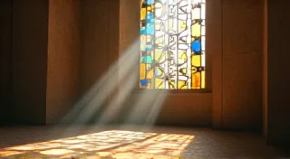
The Alchemy of Shadows: Mastering Shading with Pen and Ink
There’s a certain melancholic beauty in the workings of an old accordion. The bellows, once vibrant and responsive to the player's breath, might now bear the faint ghosts of countless melodies. The keys, yellowed with age, feel smooth beneath your fingertips, carrying the echo of forgotten tunes. It’s a testament to craftsmanship, a tangible link to a past filled with music and artistry. Similarly, the art of pen and ink botanical illustration, particularly when approaching shading, transcends mere technical skill; it’s an alchemy – transforming flat lines into three-dimensional form, breathing life into the stillness of a plant.
I remember my grandfather, a quiet man of meticulous habits, meticulously restoring antique accordions in his workshop. The air was thick with the scent of beeswax and aged wood, and the methodical clicking of tools filled the space. He wouldn't just repair; he's *reverent* in his work. Each tiny rivet, each delicate spring, was treated with the respect it deserved. Observing him taught me a profound lesson: that true skill lies not just in replicating something, but in understanding its essence, its construction, and the subtle nuances that make it unique. This same philosophy applies perfectly to pen and ink illustration.
Beyond Hatching: Understanding Light and Form
Most beginner’s guides to pen and ink shading focus on hatching – the process of drawing parallel lines to create tonal variation. While hatching is a fundamental technique, it's only the starting point. To truly capture the volume and texture of a plant, you must first understand how light interacts with form. Where is the light source? Where are the highlights and shadows? What is the surface quality – is it smooth, rough, glossy, or matte?
Think of a single petal. It's not just a flat shape. It curves, it bends, it has a thickness. The light doesn't fall evenly across it. It creates highlights where the surface directly reflects the light, mid-tones where the light is diffused, and deep shadows in the recesses. This is where the alchemy begins – translating this understanding into marks on the paper.
Cross-Hatching and its Nuances
Cross-hatching takes hatching a step further by layering lines at different angles. This creates a denser tonal value and allows for more subtle gradations. The key here isn't just to blindly layer lines, but to control their density and direction. Closer, more frequent lines create darker tones, while sparser lines create lighter tones.
Experiment with the angle of your lines. Slight adjustments in angle can dramatically affect the visual texture. Parallel lines create a uniform appearance, while lines that converge towards a point can suggest depth and curvature. Furthermore, consider varying the line weight. Thicker lines cast deeper shadows, while thinner lines create more delicate highlights. This is something my grandfather demonstrated endlessly in his accordion restoration – sometimes a slightly thicker thread was necessary to restore structural integrity while maintaining a vintage look.
Stippling: A Patient's Pursuit
Stippling, the technique of creating tonal variations using dots, is another powerful shading tool. While seemingly simple, it demands an extraordinary degree of patience and control. The density of the dots determines the tonal value – more dots create darker tones, fewer dots create lighter tones.
Like cross-hatching, stippling offers incredible versatility. Varying the size of the dots can create a range of textures. Small, closely spaced dots create a smooth, even tone, while larger, more widely spaced dots create a rougher, more textured appearance. The rhythmic quality of stippling can also be surprisingly effective in suggesting the natural patterns found in plant structures.
Rendering Textures: Emulating Natural Surfaces
Botanical illustration isn't just about accurately depicting form; it’s about capturing the *feel* of the plant. Rendering texture – the surface quality of a leaf, a stem, or a flower – is crucial to creating a convincing and lifelike representation.
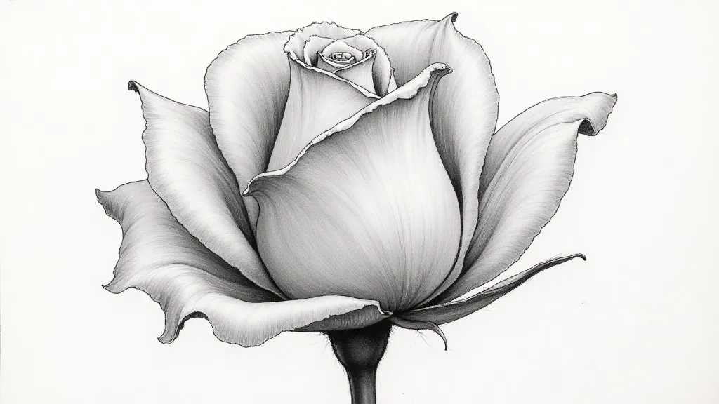
Consider the velvety texture of a rose petal. You wouldn’t render it with perfectly smooth lines; instead, you would use short, broken lines and subtle variations in tone to suggest the softness and pliability of the surface. A waxy leaf, on the other hand, would require a different approach – perhaps using denser stippling or short, parallel lines to convey the smoothness and reflectivity of the surface. The subtle grain of wood in an accordion's casing, the slight marring of a hand-stitched seam - these are the details that breathe life into an object, just as they do in botanical illustration.
The Art of the Negative Space
Don’t underestimate the power of the negative space. Often, the areas *around* the plant elements are as important as the elements themselves. Thoughtful use of negative space can create a sense of depth and airiness, and can help to define the form of the plant. Leaving certain areas untouched allows the white of the paper to shine through, creating highlights and preventing the illustration from appearing flat.
Watercolor and Ink: A Harmonious Blend
While this guide focuses on purely pen and ink techniques, the combination of watercolor and ink offers another exciting avenue for botanical illustration. A light wash of watercolor can be used to create a soft, atmospheric background or to subtly enhance the tonal range of the inked elements. The contrast between the crisp lines of the ink and the fluidity of the watercolor can be visually striking. Just as a skilled accordion repairer might use a specific sealant to protect and enhance the wood, watercolor provides a protective and enriching layer.
Practice and Observation: The Path to Mastery
As with any artistic skill, mastering pen and ink shading requires practice and diligent observation. Study the way light falls on objects. Analyze the textures of different plants. Experiment with different techniques and find what works best for you. Don't be afraid to make mistakes; they are an essential part of the learning process.
My grandfather always said that the best repairs weren's just about fixing things; they were about understanding them. The same holds true for botanical illustration. The more you observe and understand the plants you’re drawing, the more accurately and beautifully you’re able to depict them.
Ultimately, the alchemy of shadows in pen and ink illustration isn't just about creating convincing representations of plants; it’s about connecting with the natural world and expressing your appreciation for its beauty – a sentiment as resonant as the fading echoes of a beloved accordion.