The Palette of Grit: Embracing Imperfection in Ink
There's a particular kind of beauty found in objects that bear the marks of time and use – the worn leather of a beloved journal, the chipped glaze of an antique teacup, the honeyed patina on a vintage violin. I find myself drawn to this aesthetic, especially when it comes to my pen and ink botanical illustrations. It wasn't always that way. For years, I chased an impossible ideal: pristine lines, flawless gradients, a botanical rendering seemingly plucked from a scientific textbook, untouched by the human hand.
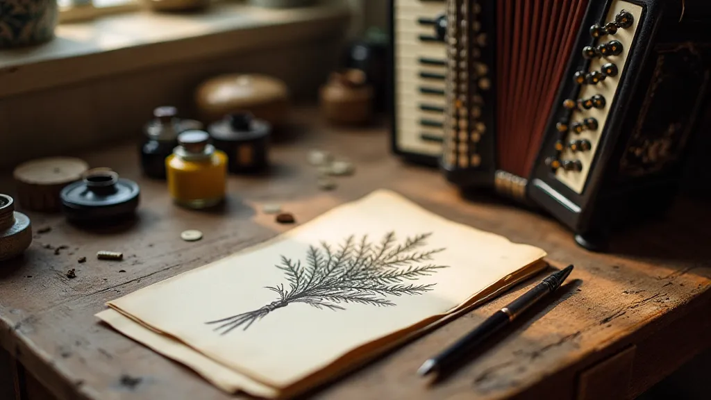
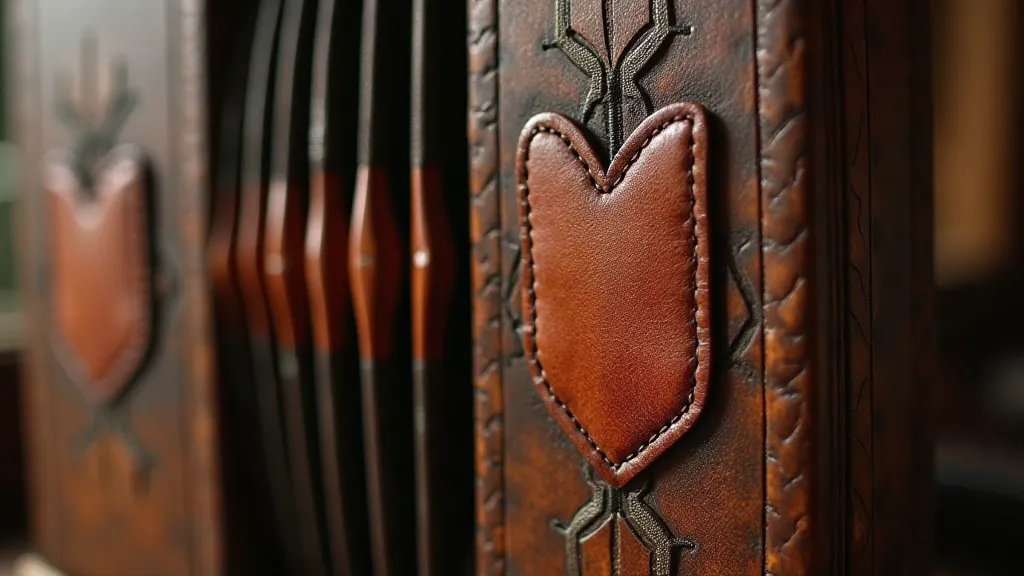
This quest reminded me of my grandfather’s antique accordion. He’s long gone, but I still have it. It sits in my studio, a hulking, beautifully flawed instrument. The bellows are patched with carefully sewn leather, evidence of decades spent squeezed and expanded, filling rooms with joyous, sometimes slightly off-key music. He would often say, “The cracks are where the light gets in,” a sentiment that I initially dismissed as folksy wisdom. But now, looking back, it encapsulates the very essence of the aesthetic I'm trying to capture in my botanical art.
The Echoes of Scientific Illustration
The history of botanical illustration is, in many ways, a history of meticulous documentation. Early scientific illustrators, bound by the demands of accurate representation, often strived for an almost clinical precision. Think of the exquisite, detailed renderings in Maria Sibylla Merian's Metamorphosis insectorum, or the precision of botanical lithographs produced for pharmaceutical catalogs. These works stand as testaments to incredible skill and observation, but they also represent a certain…distance. A desire to eliminate the subjective, to create a universal language of plant life.
I became captivated by that lineage. I wanted to replicate the level of detail, the reverence for accuracy. But in my pursuit of perfection, I discovered something vital was missing: a sense of character, of the plant's *life*. The subtle bleeds of the ink, the unevenness of the shading – these weren’t flaws; they were echoes of the moment the image was created, a tangible link to the artist’s hand.
Finding Beauty in the Bleed
The initial frustration was palpable. A bleed where a crisp line was needed, an ink blot marring the delicate structure of a petal – these felt like failures. But then I started experimenting. I began to consciously allow – and even encourage – these “errors.” A deliberate overlap of lines to suggest the complexity of a leaf’s veination. A controlled bleed to create a sense of depth and shadow. Suddenly, the 'imperfections' became tools.
The act of embracing these variations in ink behavior also necessitates a deeper understanding of your materials. Different inks react differently to paper. The type of nib you use – a fine point, a broad edge, a flexible nib – will all influence the line quality and the potential for bleeding. Experimentation is key. Test different inks on different papers. Observe how the ink settles and spreads. The more you understand the materials, the more control you have, even when allowing for the unpredictable.
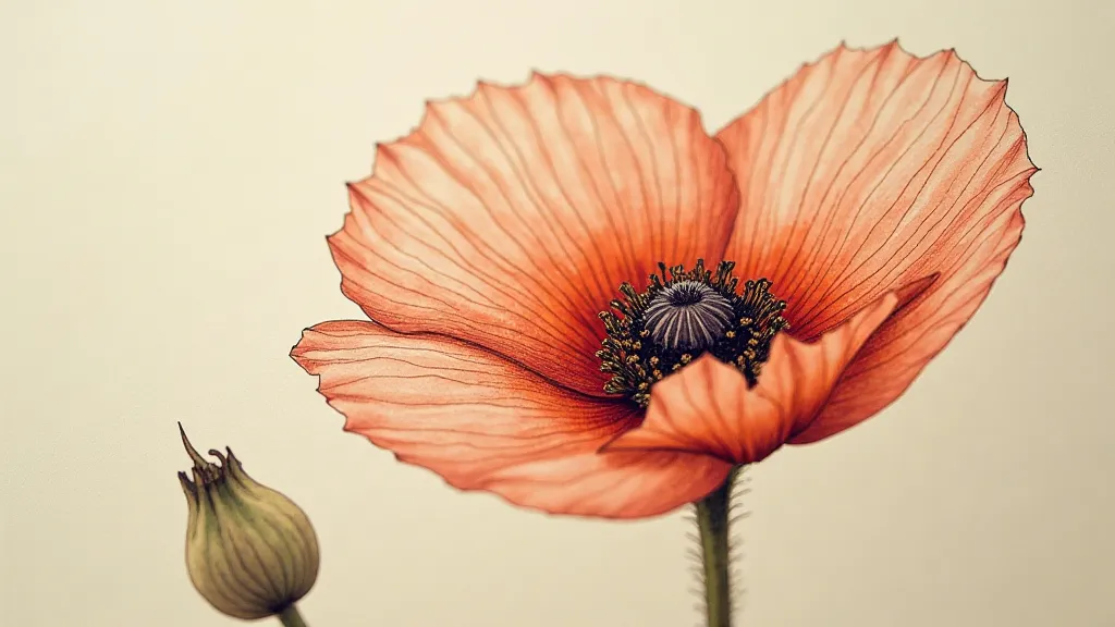
Rendering Plant Textures: A Tactile Approach
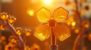
Botanical illustration isn’t just about accurately depicting the shape of a leaf or flower; it’s about capturing its *texture*. The velvety softness of a rose petal, the prickly surface of a thistle, the delicate fuzz of a lamb’s ear – these tactile qualities are essential to the plant’s identity.
Traditional rendering techniques often involve layering and cross-hatching to build up areas of tone and texture. But when embracing imperfection, these techniques become even more nuanced. Instead of striving for uniform shading, allow for variations in pressure and line density. Don’t be afraid to leave areas untouched, allowing the white of the paper to create highlights. The gaps *between* the lines become just as important as the lines themselves.
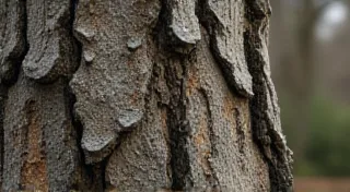
Consider the way antique wood furniture often reveals the grain of the wood, the subtle variations in color and texture created by years of exposure to sunlight and wear. It’s that same sense of layered history and organic variation that I strive for in my illustrations.
The Watercolor and Ink Combination: A Dialogue of Control and Chance
For those seeking to expand their artistic toolkit, combining pen and ink with watercolor offers a fascinating avenue. Ink provides the foundational structure, the crisp lines that define the plant’s form. Watercolor, on the other hand, introduces a layer of fluidity and unpredictability.
The challenge lies in finding a balance. Too much watercolor can obscure the underlying ink drawing, while too little can feel sterile and lifeless. I often use diluted washes of watercolor to soften edges and add a sense of atmosphere. Allowing the ink lines to peek through the watercolor creates a beautiful interplay of contrast and transparency.
This combination mirrors the way my grandfather’s accordion was used – the precise, deliberate action of pressing the keys (the ink) contrasted with the flow of air and the resonance of the bellows (the watercolor), creating a sound that was both controlled and deeply expressive.
Beyond the Technical: A Matter of Perspective
Ultimately, embracing imperfection in pen and ink illustration isn’t just a technical exercise; it’s a shift in perspective. It's about appreciating the beauty of the process, the inherent character of the materials, and the unique mark of the artist’s hand.
Just as the cracks in my grandfather’s accordion tell a story of music and connection, the bleeds and imperfections in my botanical illustrations speak of a deeper appreciation for the natural world and the beauty of imperfection. Don't strive for a flawless reproduction of reality. Instead, embrace the “grit,” the character, the life that breathes within your art.