Petal Etudes: A Journey into Floral Detail
There's a quiet reverence that falls over me when I'm truly absorbed in a botanical illustration. It's more than just rendering a flower; it's an act of profound observation, a translation of life onto paper. It's a conversation with nature, whispered through the delicate scratch of pen on paper. Lately, my focus has been almost exclusively on flowers - the endless variety, the unbelievable complexity hidden within what often seems simple. This journey into floral detail isn’s just about technique; it's about appreciating the silent poetry blooming all around us.
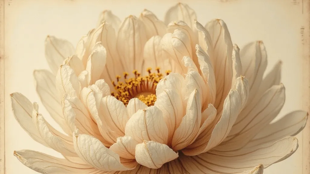
My own fascination began unexpectedly. Years ago, while rummaging through a forgotten corner of my grandmother's attic, I discovered a collection of antique botanical prints. They weren’t vibrant watercolors; these were meticulous pen and ink illustrations, dating back to the 19th century. The level of detail was astonishing. Each petal, each vein, painstakingly rendered with an almost obsessive precision. These prints, I learned later, were often used in scientific publications, a testament to their accuracy and clarity. They felt ancient, holding the breath of a time when observation was a primary mode of understanding the world.
The Historical Context: Science and Art Entwined
Botanical illustration wasn't always considered an “art” in the modern sense. Historically, it served a crucial purpose: accurately documenting plant life for scientific study. Early botanists relied heavily on illustrations to record discoveries, particularly during the Age of Exploration when new species were constantly being encountered. Think of the meticulous records kept by explorers documenting flora in unfamiliar territories; their observations brought back invaluable knowledge, often accompanied by detailed illustrations. These weren’t just pretty pictures; they were vital data, essential for classifying and understanding the plant kingdom. The line between scientific accuracy and artistic representation blurred, and a unique art form was born – a beautiful symbiosis of observation and craft.
The tools, of course, were rudimentary compared to what we have today. Artists relied on sharp pens, often made of quill or metal nibs, and sometimes, subtle washes of diluted ink to suggest color. The paper itself was often handmade, contributing to the unique character of the finished product. Each stroke was deliberate, each detail painstakingly considered. The slowness of the process fostered a depth of attention rarely found in our fast-paced world. It’s a lesson in patience, a reminder that true beauty often takes time to reveal itself.
Rendering Texture: Leaves and Petals
One of the biggest challenges in pen and ink botanical illustration is capturing texture. Leaves aren't just flat planes; they have veins, ridges, and subtle imperfections. Petals possess a softness and delicacy that’s difficult to convey with a rigid medium like ink. The key lies in understanding how light interacts with the surface.
For leaves, start by establishing the basic shape and structure. Then, focus on the veins. Don’t just draw lines; vary the thickness and darkness of the lines to suggest depth and direction. Consider the way light falls across the leaf’s surface. Thicker, darker lines can be used to represent areas in shadow, while thinner, lighter lines can suggest highlights. Using stippling – creating tones with dots – can beautifully mimic the subtle texture of the leaf’s surface. Experiment with different dot densities to create a range of values – a denser concentration creating darker shades, and a sparser distribution, lighter values.
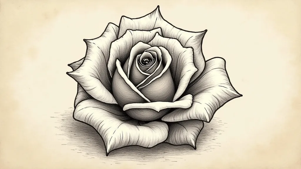
Petals present a different set of challenges. Their inherent delicacy requires a lighter touch. Avoid harsh lines and sharp angles. Instead, use curved lines and soft shading to suggest their gentle curves and ethereal quality. Hatching, where parallel lines are drawn close together to create shading, is particularly effective for rendering petals. By varying the spacing between the lines, you can control the value of the shading. Don't be afraid to leave areas unshaded; the white of the paper can be just as important as the ink itself.
Shading and Value: Creating Dimension
Value, the lightness or darkness of a tone, is crucial for creating the illusion of three-dimensionality. Without it, your illustration will appear flat and lifeless. Start by identifying the light source in your reference image. This will help you determine which areas are in shadow and which are in highlight. Then, use a range of values to represent the different surfaces of the flower.
There are several shading techniques you can employ: hatching, cross-hatching (where parallel lines intersect to create darker values), stippling, and blending (using a brush or cotton swab to smooth out the ink). Experiment with different techniques to find what works best for you. Remember that subtle gradations of value can create a sense of softness and realism. Don’t be afraid to make mistakes; they are an inevitable part of the learning process.
The Watercolor and Ink Combination: Expanding Possibilities
While pure pen and ink botanical illustrations are beautiful in their own right, combining ink with watercolor can unlock even greater possibilities. The ink provides the crisp, precise lines needed to define the structure of the flower, while the watercolor adds a touch of color and vibrancy. This combination can be particularly effective for capturing the subtle nuances of floral hues.
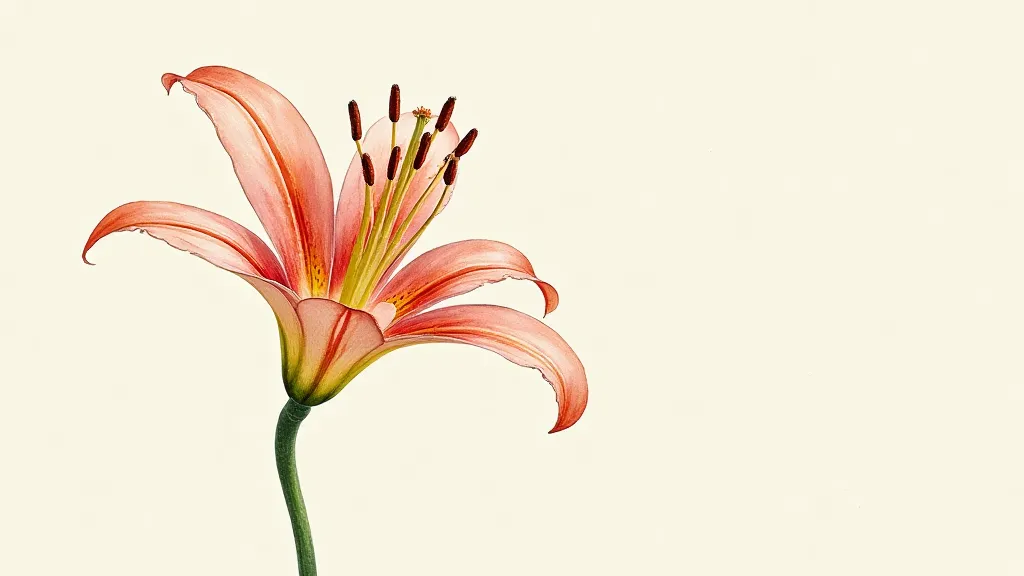
When working with watercolor and ink, it’s important to plan your approach carefully. First, use the ink to create the outline of the flower. Then, let the ink dry completely before applying the watercolor. This will prevent the ink from running. Experiment with different watercolor techniques, such as wet-on-wet (applying watercolor to a wet surface) and dry brushing (using a brush with very little water). Remember that patience and experimentation are key to mastering this technique.
Drawing Scientific Illustrations and Plant Anatomy
Returning to the historical roots of botanical illustration, the creation of truly scientific illustrations demands a level of accuracy exceeding purely aesthetic concerns. These illustrations aren't about conveying a feeling or a mood; they are about documenting a specimen with meticulous detail. This includes not just the external features, but also a representation of the underlying plant anatomy. Dissections and cross-sections are common elements, showing the arrangement of tissues and organs. Scale bars are often included to provide a sense of size. While aesthetically pleasing, the primary goal is to facilitate understanding and comparison.
Drawing from life is, of course, the best way to learn, but thorough observation of detailed reference photos is invaluable, especially for those interested in the meticulous detail of scientific illustration. Embrace the challenge, relish the opportunity to slow down, to *really* look. The quiet, focused work offers a meditative quality and a deeper appreciation for the wonders of the natural world.
